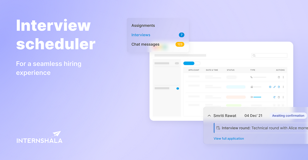
Documenting how we made hiring easier and faster with a world-class product for all hiring needs at Internshala.
My role & Team
As a product designer with Internshala, I got the chance to experience and understand the fundamentals of the hiring process almost 12 months back when I was assigned as the primary designer to work on the employer side of our product, since then it has been a learning experience every day at work which I would love to document and reflect upon.
I collaborated with the PMs to identify gaps in the design, curated user stories, and built prototypes, user flows and final mockups.
Team
2 Product managers (1 for employer & applicant side each)
2 Product designers ( I was responsible for leading the project & designing the employer side use cases also reviewing other designer’s work for the applicant side chat modules)
Senior designers & other stakeholders for review and approval.
Duration ⏳
2 months of Research — Design — Dev handover.
🔍 DISCOVER PHASE
The context
We did a calling activity with employers to understand how they use our product for hiring. What is the process they follow to hire a candidate? What are the pain points they experience in the process?
Typical hiring process on Internshala —
Group A employers:
Their team size is usually very small. Founders/freelancers responsible for complete hiring.
Employers from this category mostly use Internshala for an end to end hiring. Generally use notes/excel sheets to keep track of assignments.
Group B employers:
These are recruiters who involve multiple folks in the hiring process.
More than one person is involved in the hiring process.
They use Internshala for screening & shortlisting candidates. Once done with the initial process, they collaborate with their team members on the email thread or by using other tools like google sheets, Trello etc.
From user interviews, we couldn’t establish a common pattern of the hiring process but…
🧩Some trends that were observed are as follows-
Employers send bulk messages to all the applications received for the post. The candidates who revert are considered for the next steps.
Employers believe that resumes sometimes could not do justice to an applicant’s calibre but assignments are a good way to gauge their potential.
Employers screen and filter candidates on the basis of their application and then reach out to candidates via chat.
Goal
The ultimate objective of employers is to hire quality talent — fast and with minimal effort. From the user interviews, we figured out common employer/ recruiter expectations with job boards like ours-
The problem
In order to adapt to dynamic customer demands, we continually modify or add new features to our products. To keep pace with such a process, we put together…
Some basic problem statements on the employer side to better understand the pain points with the hiring process —
Employers have to coordinate with applicants’ on their own. They don’t have a place for tracking their availability for interviews if they are not synced with the calendar app. (Google calendar, etc.)
Reschedule requests from applicants’ are hard to track. Employers often find it difficult to track who asked for rescheduling and what’s the applicant’s requested time.
No option to revert candidate status to not rejected from the rejected bucket. Usually, employers have to go through a long list of eligible applicants from the applications received bucket. This includes contacting, shortlisting, rejecting or hiring them from the given action buttons, which results in the occurrence of errors once in a while that is irreversible and required manual support from the help centre.
Follow-ups add time to the process. Employers are often required to shortlist candidates for the interview process on their own. No data of any upcoming and past interviews with the applicant at one place is available.
Problem statement on the Applicant side:
Applicants miss out on interview messages these interview requests are sent through chat messages. It’s hard to get notified if they are not logged in every time.
No option to request reschedule time if the applicant is unavailable for the scheduled interview call they can only revert to the text message.
No reminder of scheduled calls often leads to delays and rescheduling.
Understand
Since it was early in the process, we reviewed the competitive design landscape by identifying and researching similar websites. Then curated the analysis and mood board findings to find opportunities to stand out and differentiate the product.
Competitor analysis
Key Takeaways :
Most of the interview and meeting scheduling tools share similar basic functionalities, but they seek to differentiate themselves for a better experience with some additional features.
2. No way for a user to quickly check their schedule and get a summary without browsing through the calendar.
3. Finding free slots is time-consuming as there was no way to add new events quickly to the slots.
5. Need to switch apps before scheduling an interview with anyone.
6. Indeed does a good job of allowing the recruiter to schedule an interview from the chat as well. ✨
🤝EMPATHIZE PHASE
After conducting initial research, the next step was to empathize with the user and their problem/ needs and derive a user persona for the task.
Problem Definition
This stage mainly deals with making sense of the data gotten from the empathy stage. We had to make sense of what we heard and saw, and also what we could infer from our research.
After gathering data and understanding the requirements, a set of problems that are needed to consider while design was formulated. This was done using the HMW (How might we) method in which each problem is converted to a “How might we…” question-
How might we give the ability to the user to view all upcoming, overdue or completed events/meetings in one place?
How might we make it scalable so that the same design can be extended to other use-cases?
How might we allow users to know the ongoing interviews scheduled with the applicant and set new events which are based on their availability?
How might we enable applicants to request reschedule by themselves without calling/ texting the employer?
Target user
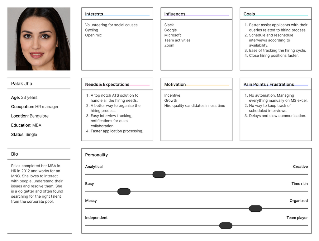
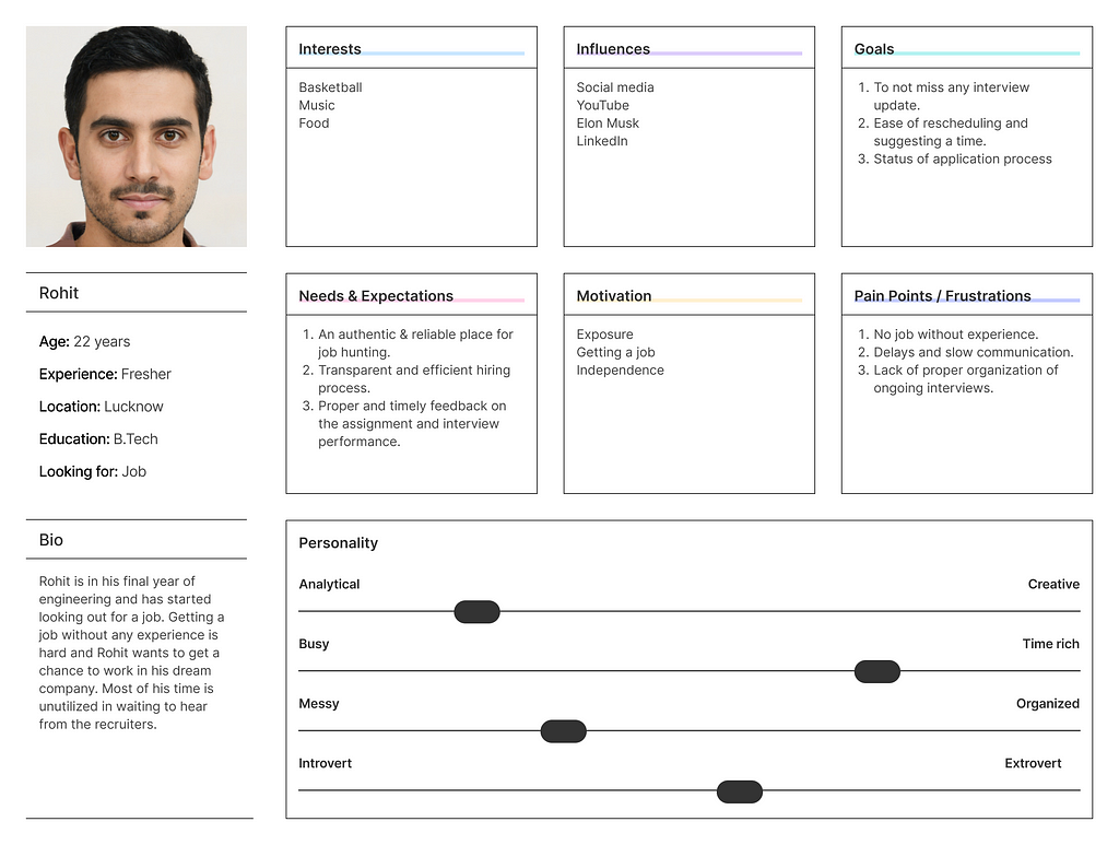
User Persona
Focusing the results into a single user persona that encompasses the project baseline standard we created 2 user personas for both employer and student side use cases.
Employer personaApplicant persona
User stories
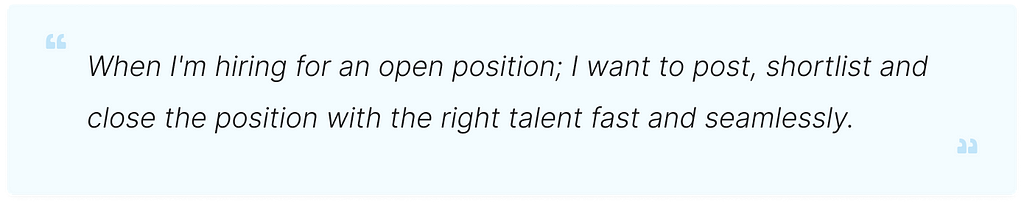
As an employer
I want to schedule my interviews & get students’ responses in a structured manner in one place. Currently, I go to chat, search messages and then know the status of the numerous interviews I have scheduled.
I have to refer my calendar back & forth to see my free slots and then schedule interviews on the product.
I can’t add interviews to my calendar through the product(and sync my daily routine) as well as offline (in one go) as I don’t have students’ email ids upfront. In order to do this, I have to ping students and ask them for their emails.
I want to get reminded about my upcoming interviews.
As an applicant
I want my interviews to be properly scheduled. I don’t want employers calling me anytime.
I want to get reminded about my upcoming interviews so that I don’t miss any.
💡IDEATION PHASE
Information Hierarchy
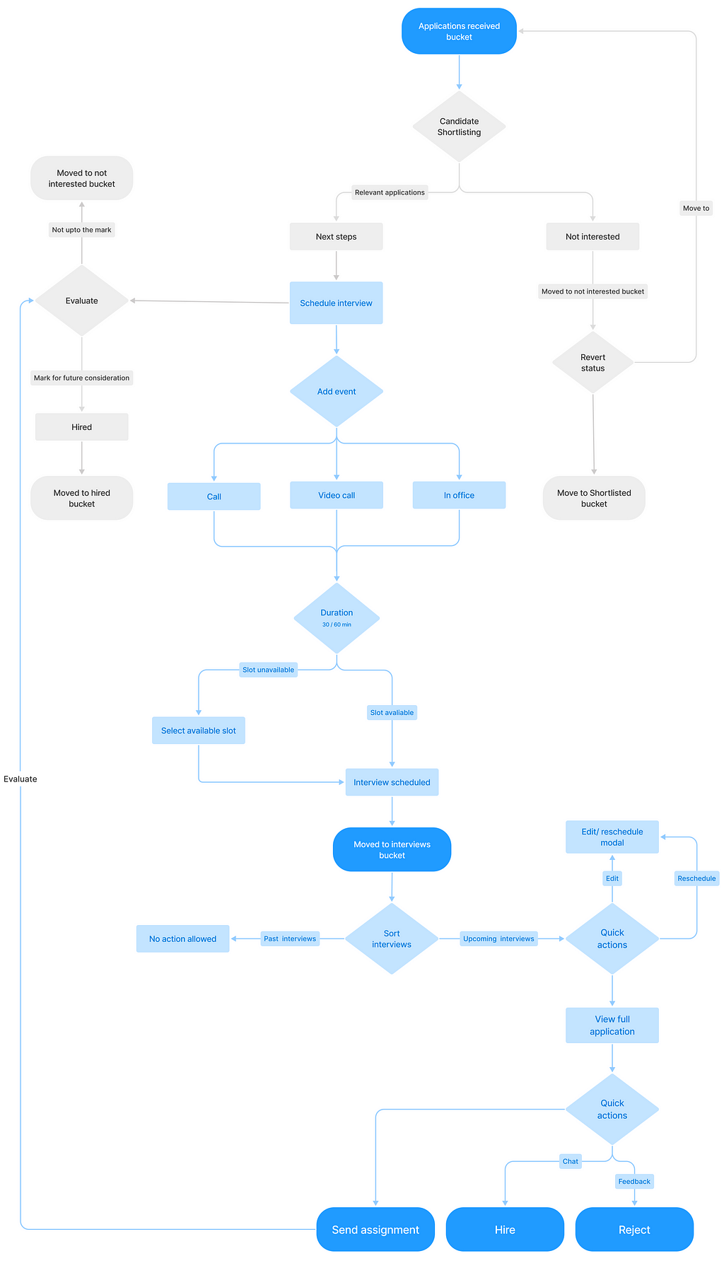
I created a simple flow for employers to shortlist candidates, schedule an interview and also mark them for future consideration. In this document, we will take a look at 2-3 specific flows.
User flow
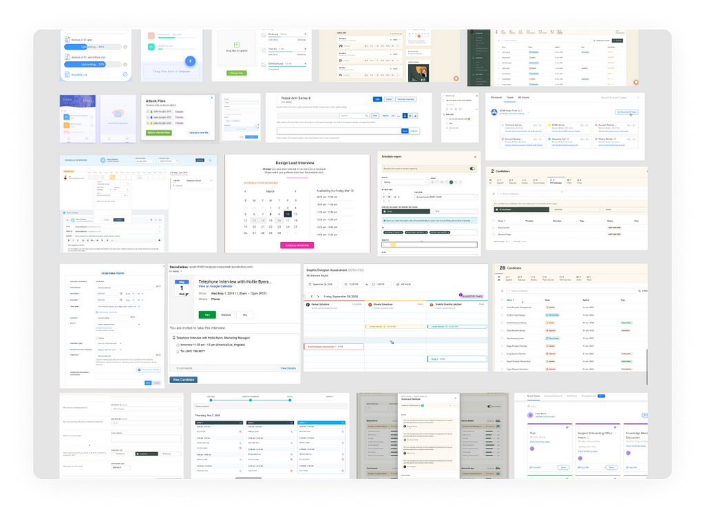
High Fidelity Mockups
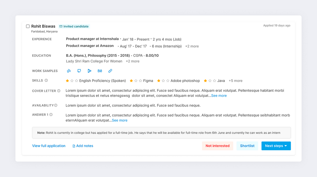
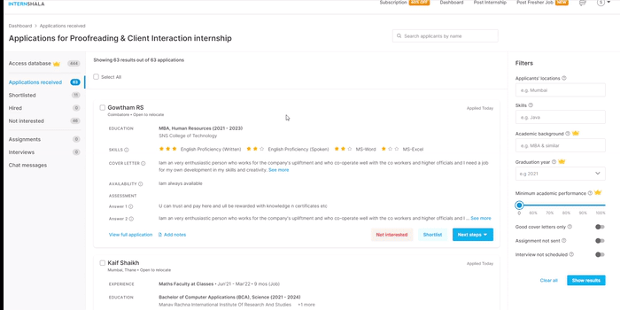
1. Applications received bucket (ATS)
List view of all the applications received for a particular posting. Employers use this for shortlisting an applicant or moving to the next steps in the process.
Card detail in ATS list view
UX improvements on the page —
Increased CTA size to increase the tappable area on the screen and prevent an error of clicking on the not interested button unintentionally.
Option to add notes on the candidate card itself for faster evaluation.
Use of semantic colours for better interpretation and faster decision making.
Adding Interview scheduled/ Assignment sent/ shortlisted tags on the card for easy scanning among the list of applicants.
Renamed ‘Reject’ to ‘Not interested’ to protect user sentiments and sound less harsh to the user on the other side. #1
Reducing the number of action items on the card to 3 for faster decision making. #2
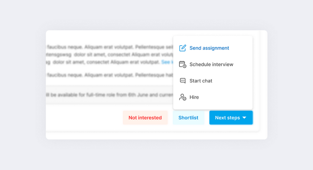
Tip #1Tip #2The next steps dropdown
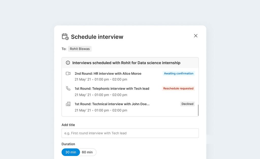
2. Schedule interview modal
On clicking, schedule interview from the next step CTA this modal pop up where the applicant name and an auto-generated description text is pre-filled with the employer phone number for the scheduled interview.
UX decisions on the modal—
To have the first field as the title field for the interview so that the applicants get notified with that specific heading.
Provided ‘Need help’ link in case user faces issues with providing video meet links.
All three interview types have icons to make interpretation easier.
3. Past interviews scheduled with the applicant-
If there are interviews lined up or were scheduled with the applicant then we show them in a past interviews window on the modal at the top. #3
Tip #3Past/ ongoing interviews scheduled window in the modal
The interviews are shown in reverse chronological order.
Designed with the maximum content to check the feasibility of design for every resolution.
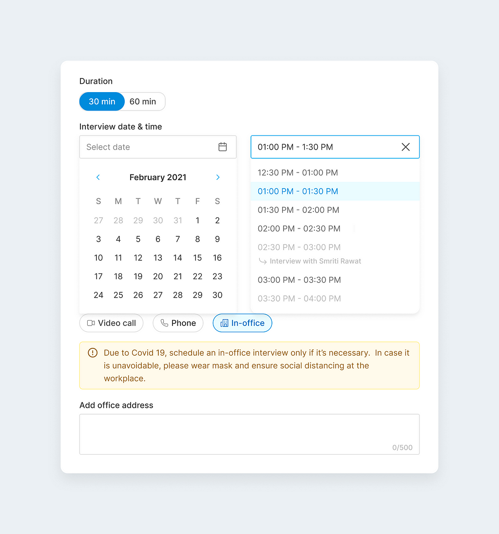
4. Date time slot selection
Finding the ideal time slot for the interview made simple.
Schedule interview modal
The time slot dropdown would show the unavailable slots with a small description of what’s happening during that slot. #4
Tip #4Video
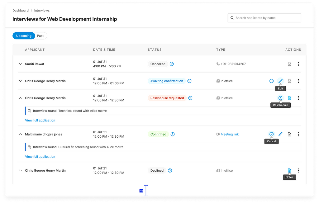
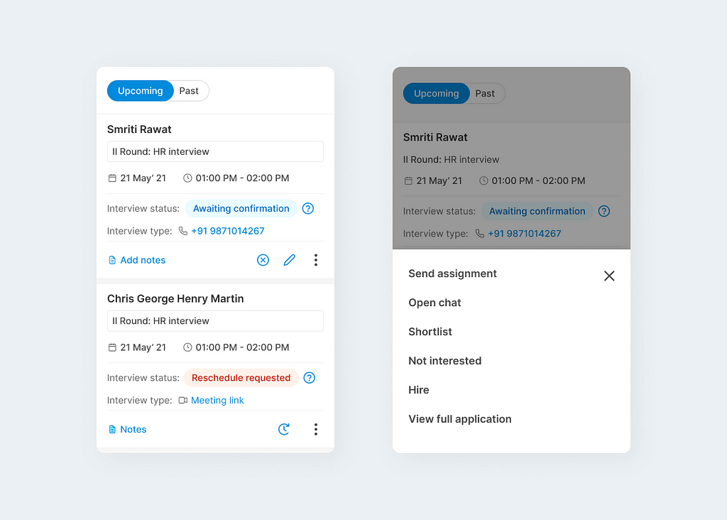
5. Interviews bucket (ATS)
The interviews bucket can be accessed from the left panel on ATS where all the other buckets are present.
UX decisions on the page—
Switch easily between upcoming and past interview tabs.
All the actions correspond to each row of applicant & to save column space only icons were used as action buttons.
The width of the table was kept while keeping in mind all the existing breakpoints of the page.
To have ‘TYPE’ column entries as clickable for a better experience. #5
Clubbed similar and repetitive actions like- Send assignment, Open chat, Hire & Not interested under vertical ellipsis.
Status tag colour as per the action required and to bring attention to the more important status. For example, using red to bring attention to Reschedule requested interview. #6
Tip #5Tip #6Interviews bucket in ATSInterviews bucket for mobile resolutions
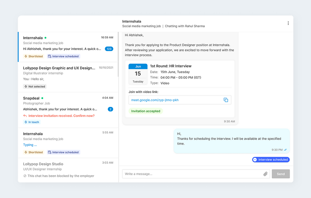
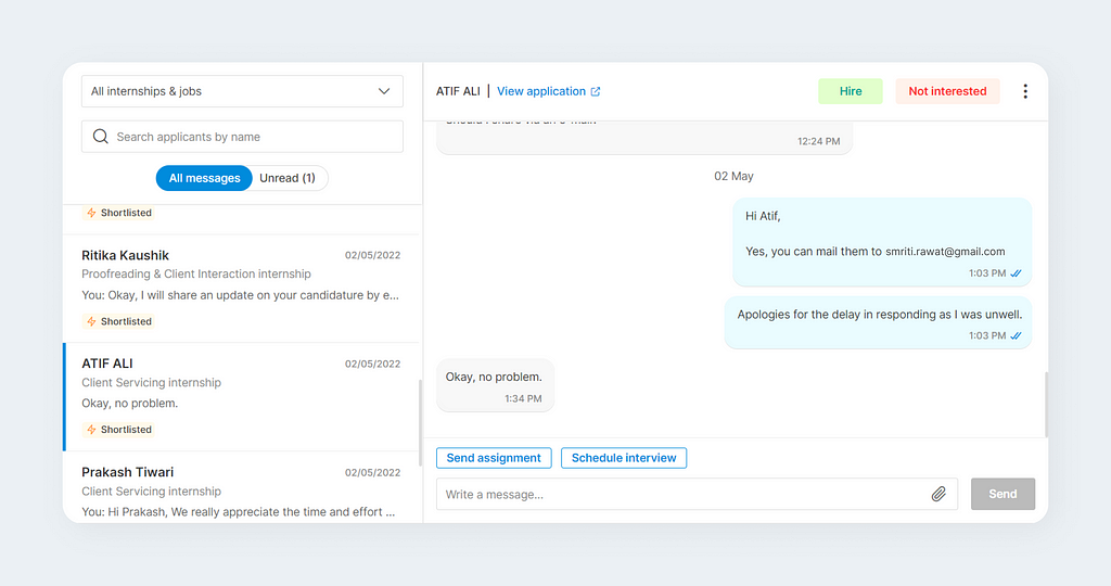
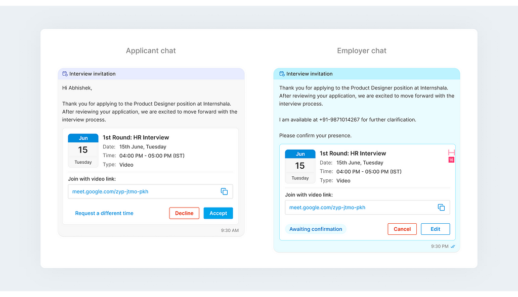
6. Chat module
The chat module was one of the intricate and exciting task flows we have worked on, as there were two user journeys together (Employer chat and Applicant chat) which we had to cater to.
Designed by fellow product designer where I was involved in design review and discussions.
Highlighted the chat bubble for interview so that it’s easily distinguishable from other chat messages, as we observed during the user interviews that applicants mostly miss out on employer chats with interview invitation.
Introduced a Floating action button to remind the users about the scheduled interview. This FAB would take to the respective chat invite upon clicking.
Designed for all the use cases and edge cases so that we don't miss out on any important screen.
As there’s a lot that went behind designing this amazing tool and lots of learnings which makes it difficult to document each and every use case here. Apart from these screens we also designed for app and reminder emailer templates. But I’d still like to mention some take aways from this project below-
Take-Aways
Understanding business objective with the feature requirement is also important. Always ask why we need this feature, and what we aim to achieve with it, instead of casually following what other platforms are doing.
Drawing the user journey and the user flows before starting the design would give a lot of sense of how the feature would come in place when its an MVP that’s being built from scratch.
Constraints are crucial but that shouldn’t hold us from experimentation.
Create workflows as you want them to be explained to you.
Working closely with product managers gives a whole different perspective to the problem we are trying to solve.
How did it work? — The Rollout
We released the interview scheduler feature just a few months after going live with the assignment tool. Data came in… number of interviews scheduled, number of interviews accepted, etc. After analyzing it for a couple of months and…
40k interviews were scheduled, over 20k students had confirmed it within 3 months of feature rollout. Yay✨
Future scope of improvement
Having a map view for the office address if the employer selects an In-office interview. This would require third party integration of google Maps which we currently don't have on our platform.
Multiple reviewers and recruiter to be able to schedule & evaluate interviews.
Google calendar integration would make the experience more functional as it would show the availability of time slots other than only interviews scheduled on our platform.
The End
Additionally, this was the most extensive problem statement I’ve ever worked on and it is the quality, attention to detail, time and thought that has given it its status. This was the first time that I felt like a real problem solver. I had all the tools, resources and data I needed at my disposal so that I was able to perform at my best.
Lastly, a big shout out to all the amazing folks without whose effort this wouldn’t have been possible- Abhishek (Product designer), Venkatesh (PM employer side), Purnima (PM applicant side), Trinkush & Shivani (Reviewers). Thanks Vikram and Sarvesh for your valuable inputs.
That’s all for now, follow for more such case studies and insights!
📍Drop a hello or connect with me on LinkedIn | Twitter | Behance if you want to know more about this project!